MAPfrappe.com allows anyone to outline an area on Google Maps, and then compare that area elsewhere on the Earth.
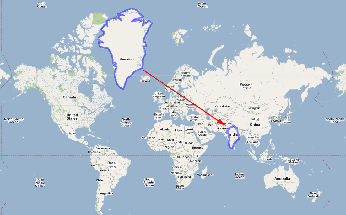
 The size and shape of areas on Google Maps is distorted throughout the map because it uses a variant of the Mercator Projection. The scale of the distortion increases from the equator to the poles (see right figure). Areas appear relatively larger at the poles and smaller at the equator.
MAPfrappe compensates for these effects. The results of moving an outline around the map can sometimes be surprising.
For example:

Try it out, or view a previously created outline:
The above Google spreadsheet is publicly shared. Anyone can edit it. Create an outline on MAPfrappe, make a url, and add it to the spreadsheet at Google Documents: MAPfrappe Index.
More examples:


HOW ARE THERE NO COMMENTS ON THIS YET! THIS IS MIND BLOWING! PEOPLE NEED TO KNOW THE TRUTH!
ReplyDeleteYeah! Mercator is a fraud! They should have burned him like an HERETIC!
ReplyDeletei cannot even believe what i have learned about geography and maps have been a joke :(
ReplyDeleteNo Maldives on the list
ReplyDelete